Showing posts with label Charts. Show all posts

Friday, August 02, 2024

Charts #51: Olympics

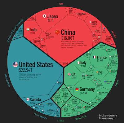
Found a good chart on the usual Visual Capitalist site, one of the most powerful visualization of data and statistics platform around.

Will we see a day it costs USD100bn to host the Olympics? That would just be a matter of time. Inflation should most certainly take care of that. We will also see the first 10 trillion dollar company, the first trillionaire, the economies would be measured in quadrillions!


Friday, October 20, 2023

Charts #50: More on Property - Offices

The pandemic upended offices with vacancy rates hitting all time high in some cities as the chart below shows. This has impacted property valuations and changed the landscape for entire vicinities.

Interestingly, it also reflects work culture in different parts of the world and different industries. Asian workers tend to head back to office while tech startups are resisting. 

But if we can stretch on the horizon, we should revert to norms over time and therefore it might be a good time to start buying office reits now!

Friday, July 07, 2023

Charts #49: HK property prices

I recall thinking HK was the ultimate litmus test on whether property in Asia always goes up. With all the issues, protests and 2047 - full return to China looming, can prices actually hold?

Over the last few years, data has shown that what goes up must come down. On the broad aggregate basis, prices have fallen 5-7%. Amongst the developed cities in Asia, it is by far the worst performing city on a 5 year basis. 

A closer look at the price index chart shows that the drop is worse. From the peak of the index at 400, it has dropped c.15%. That means that some properties could be deep in red, having fallen 30-40%. Those owners could be in a lot of financial trouble.

Our own little red dot has done well so far. But we never know. My advice would be, don't trade your only property. Don't be too greedy and over leverage on multiple properties and in today's interest rate environment, pay down that mortgage fast!


Friday, June 02, 2023

Charts #48: SWF and PPF Returns

 This is a good chart on returns of SWF (Sovereign Wealth Funds) and PPF (Public Pension Funds)

Most large funds cannot beat the S&P500 return of c.10%pa.

Sunday, February 19, 2023

Charts #47: Alphabet / Google

 This is a good chart to understand Alphabet / Google at the big picture level. The bulk of earnings still come from basic search with Youtube and Google Cloud growing well. 

Courtesy of FourWeekMBA.

Google processes 8.5bn search every day, ie almost everyone on earth use Google at least once a day and it takes a cut. From the $162bn revenue, this cut is 5c (162 / 8.5 x 365). Just very rough math.

Thursday, September 15, 2022

Charts #46: Fed's tightening

We are finally getting back to textbook's environment of risk free rate at 3% after years of QE although it remains to be seen if this can last.


Since Singapore's monetary policy imports rate from the US, do keep buying Singapore T-bills while the interest is still good!

Wednesday, August 17, 2022

Charts #45: Food inflation

 This chart from The Economist says it all.

Also, we are running out of raw material for our food. Malaysia's export ban of fresh chicken to Singapore was quite worrisome a few months back (see below).

Well, fortunately, we didn't reach this stage. But chicken rice no longer cost $3 and I think we are on our way to find hawker chicken rice cost as much Chatterbox's chicken rice (when it first came out).

Tuesday, May 03, 2022

Chart #44: Taking stock of COVID-19

Two and half years ago, we could never have seen this coming. Over 500m infected and 6m deaths. 

Google screenshot

The number of deaths annualized is 3x the no. of people dying from flu (300-600k according to WHO)

May the Force be with us all!

Tuesday, February 01, 2022

Charts #43: The World

I check in with visual capitalist once in a while. I would recommend all investors do the same. This chart is worth scrutinizing and see how it will change 10 to 20 years from now.


Jim Rogers famously said the 21st Century belongs to Asia. Well, look like we still need to grow. We are counting on India now!

Do check out the visual capitalist, they are awesome!

Happy Chinese New Year, huat ah!

Wednesday, December 15, 2021

Charts #42: Offshore Wind

 This is an interesting chart from the Economist last month. Optimal offshore wind locations are at a certain latitude and we just need to build 500k offshore wind turbine to contribute to 7.5% of global energy output.

Offshore wind

Well, we are not starting from zero, we have 7,000 today. And to power the whole world, we just need to 7 million wind turbines at these optimal locations.

Friday, October 22, 2021

Charts #41: Breakthrough Energy

Breakthrough Energy is one of Bill Gates' company that is big on sustainability. The following chart and link provides good info for future reference.


https://www.breakthroughenergy.org/our-challenge/the-green-premium

The sustainability problem will become one of the biggest topic for us and our children. Let's hope we can solve it!

Thursday, September 09, 2021

Charts #40: Meatless market

The meatless market has grown on the back of sustainability theme reaching USD 17 billion in size. The forecast below projected the growth to be flat but it's probably wrong.

Vegetarians used to have a hard time because people cannot understand why they want to stop eating meat. Living things have to eat livings to survive. I see them being ridiculed, sometimes it's not really fair.

With sustainability and vegan movements coming forth, the tide is finally turning. Now eating meat is increasingly a sin. But even if most of us cannot stop eating meat, we should eat less of it for Earth's sake. 

Be a flexitarian!


Thursday, April 08, 2021

Friday, February 12, 2021

Charts #37: QE and Property

Three charts for today.

US property prices keep rising despite COVID-19.

HK property prices not falling despite umbrella riots and COVID-19. This is the power of QE. Do not fight the Fed.

Another chart to drive the point home. Apple's market cap hit 2.34 trillion dollars. We were so excited then it was closing in one trillion just 18 months ago.

Do not fight the Fed.

Happy Chinese New Year! Huat Ah!

Wednesday, November 25, 2020

Charts #36: Tesla

Another day, another enigma.

Tesla, a company that hasn't made profits cumulatively over the last 10 years, makes a mere 300,000 cars, is bigger than Toyota, Volkswagen, BMW, General Motors, Ford, Fiat Chrysler and Honda combined!

The automakers listed above make more than 30 million cars annually. 100x more than Tesla. 

It also dwarf the recent inclusions into the famed S&P500 by a mile!

Well, maybe bcos it did finally generate USD1bn of FCF after burning USD10bn since its inception. Remember the market only looks forward, not backwards.

Or, we can attribute it to the Power of QE Infinity. 

To Infinity and Beyond!

Friday, October 09, 2020

Charts #35: Cybersecurity

This is one big growth area for the next five years.

Breaches have increased. Old chart - only until 2017. But should have kept going up.


Spending has increased and will continue to do so.

2019 was big. Well, 2020, with COVID, should have exacerbated the need for more security.

Buy HACK US - cybersecurity ETF. But do your own due diligence. Or check for my update here when I get down to do it.

Huat Ah!


Wednesday, September 16, 2020

Charts #34: COVID Economy Pulse Check

 Two interesting charts to share from FT.

Is it just a matter of time for economies to come back or will the world really change and we take many many years to go back to 2019 levels?

Human beings want to go out. Can we really stay at home and WFH forever? We may not see it now, but the world should normalize again and we go back to our old ways with some incremental changes - use ZOOM a bit more, wear masks outside etc.

Sunday, August 16, 2020

Charts #33: Global REITs

 Found a good chart depicting the global REIT space.

The world has changed since COVID-19, but I don't think retail and office will collapse 30-40% over the long run. Humans are creatures of habits and we eventually revert back to our old ways.

Although, travel will take a much longer time to comeback, so hotels need to have sufficient cashflow to tide over the next 1-2 years. Hope this helps!

Friday, July 24, 2020

Charts #32: COVID Market and Currency Impact

COVID-19's impact on the markets and currencies provide interesting perspectives. Tech stocks has completely outperformed as social distancing forced people to carry out more activities online. Nasdaq zooming passed its all-time high is exemplary.

Source: Asian Nikkei Review


The impact on currencies tell two tales. Developed markets are doing much better than emerging markets. The virus does differentiate. If you live in a developing country, with poorer social infrastructure, chances of death is that much higher. The economies of weaker countries will find it harder to come back after the coronavirus crisis.

Thursday, May 14, 2020

Charts #31: Asian startups

Here's a dated chart from WSJ. The startup boom ended with the arrival of the coronavirus. Let's see how many will still be around in 18 months.


Grab has come a long way. Hopefully it will be fairy tale ending with rainbows for this ASEAN unicorn. Huat Ah!